Stan Store • 2023
Your All-in-One Creator Store
Project Overview
In this case study I’ll be sharing my process for redesigning the sign-up and onboarding flow for launching a new digital storefront. Over the course of a month, I worked with one Lead Designer, the Head of Customer Success, and a team of 12 Developers to improve the Sign-Up and Onboarding experience.
ROLE
Product Designer
(June 2022 - April 2024)
TEAM
Head of Creator Success
Head of Marketing
Engineering Team
TOOLKIT
Figma
FigJam
Adobe (Ai, Ae, Ps)
SKILLS
Design Systems
Visual Design
Marketing Design
read the case study
Let’s tackle the problem by asking questions. Users quote that they love Stan for it’s simplicity, so:
1. How might we deliver another layer of simplicity without disrupting the user experience?
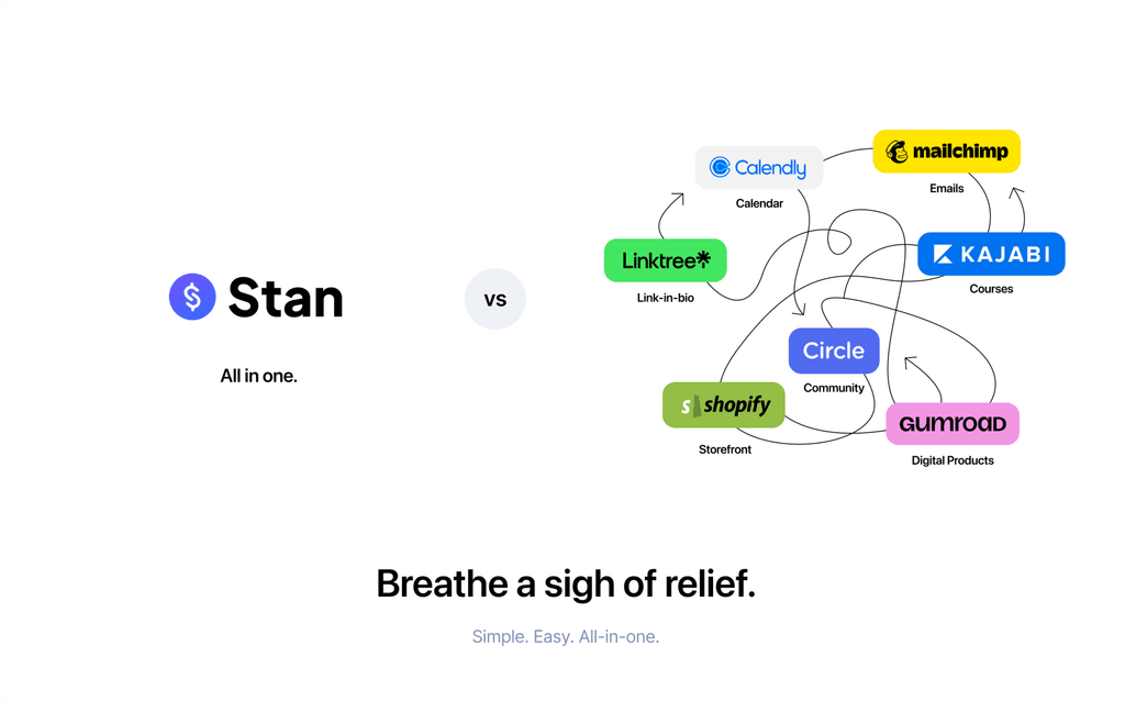
2. How might we clarify value proposition and differentiate from similar platforms?

Define how users measure simplicity.
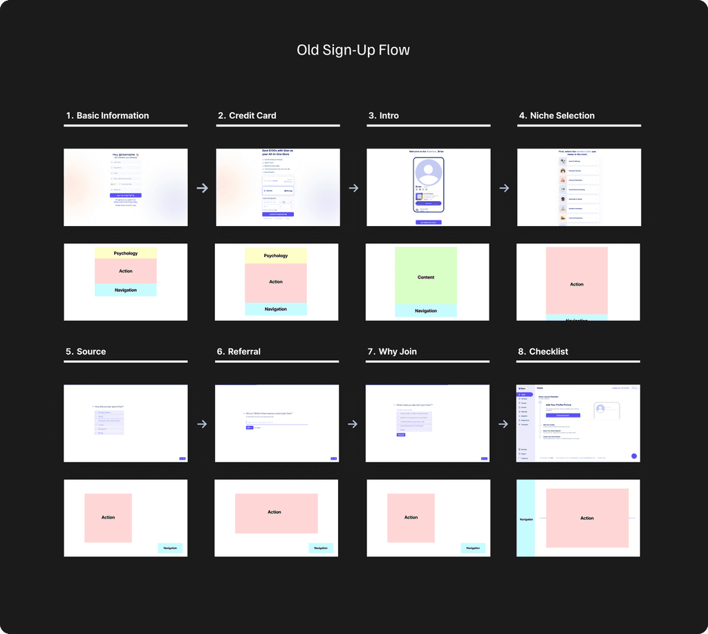
Identify areas of improvement: areas where (1) value props are not clear (2) action items are not clear.
Suggest, Implement, and Test Baseline Improvements.
minimize friction
Decrease the # of user actions, make sign-ups and onboarding less time consuming.
CREATE VISUAL ELEMENTS
Confirm action behaviors with clear and concise visual elements.
ACTION VS CONTENT AREAS
Increase content areas to increase user engagement.
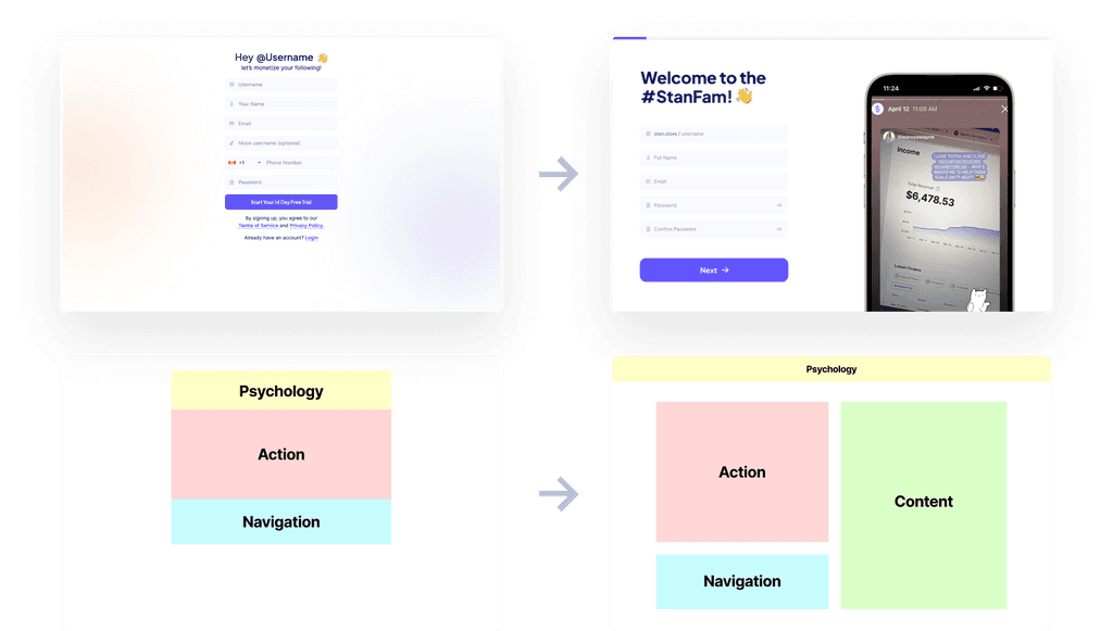
Decrease User Actions
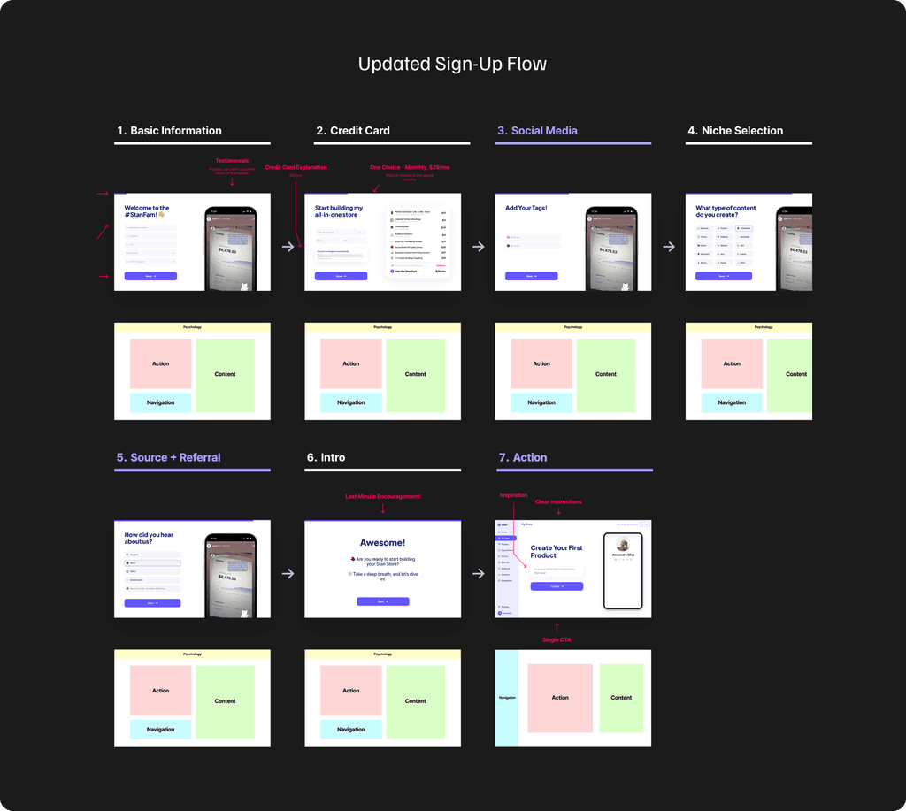
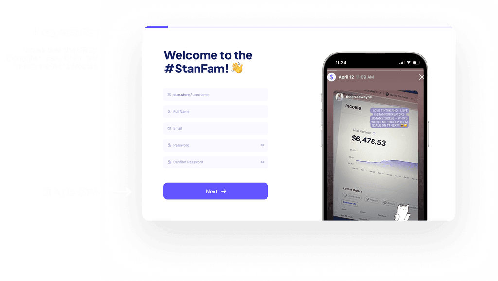
Giving the user more control over their time with a progress tracker bar, located at the top of the screen. On a similar note, grouping similar questions together helps the user avoid content overload while also saving time.
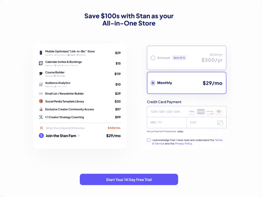
Visually Communicate Value Props
Every step aims to convey a clear visual ROI to the user for what they’re doing (ex. Value breakdown chart on the Payment Info Screen). Subtitles also help the user understand how each page will provide value to them (ex. Experience Level Page - We’ll give you personalized advice based on your experience level.)
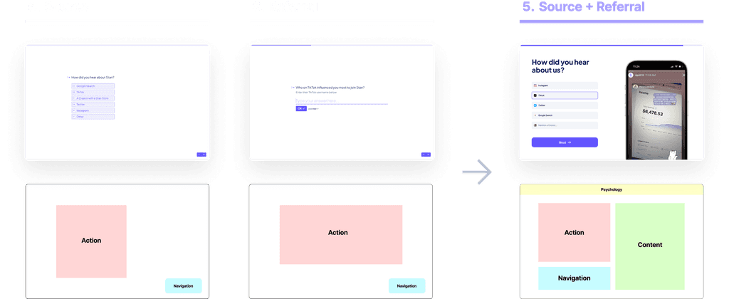
Balance Action versus Content Areas
An increase in the content area (shown as green colored blocks on the right) keeps the user engaged and informed on Stan. Clear partition between action and content areas helps the user avoid confusion and feeling overwhelmed. Composition between the sign-up pages are kept relatively similar. This allows the user to become increasingly familiar with the page structure.
STAN
Diligent note-taking during weekly all-hands meetings + design critique sessions helped to streamline communication and enhance team efficiency, serving as a crucial reference point for revisiting specific details and insights. I learned that in attentive documenting, I was able to make more informed decisions, leveraging information from past discussions to refine and optimize my designs.
Although designs should be intuitive and rooted in research, they should also strive to engage users on a deeper emotional level. I learned that great design goes beyond usability; it’s about crafting experiences that leave users not just satisfied, but genuinely excited and emotionally connected to the product.

