Stan
2024 / DESIGNER
Designing an onboarding flow and store editor for a digital creator storefront platform.
I spent a year and a half at Stan, working on building a digital store platform that automates all of the ‘business stuff’ so that Creator’s can spend their time doing what they love - creating great content. In addition to product design and UX/UI work, I created graphic designs, wrote marketing copy, and edited videos on After Effects.
Short on time?
View a quick overview deck of my work @ Stan: 📂 Design Deck
Product Preview

UI UPDATES
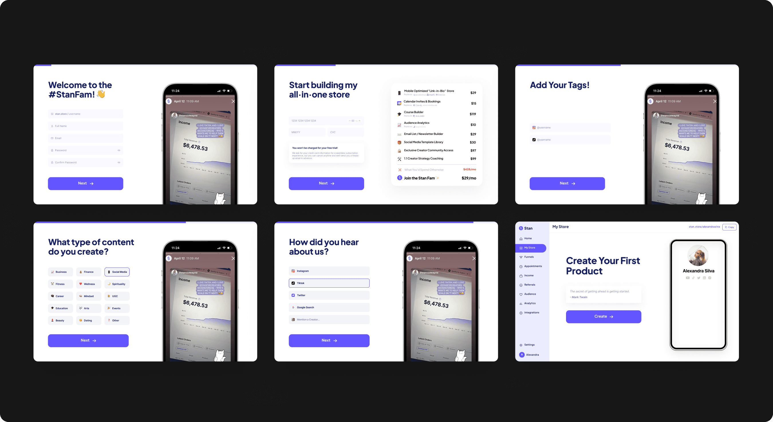
Refreshing the onboarding flow
Decreasing user actions and practicing forgiving UI through question groupings, progress tracker, balance in content vs. action areas

STORE EDITOR
Personalizing Store Designs
Giving users more control and autonomy over the look and feel of their Stan store through a store editor tab (font, color themes, store themes)

VISUAL ASSETS
Marketing Value Props
Creating visual value props for marketing assets and embed use in onboarding flow steps. Displaying contextual ROI visuals to the user
Jump to design solution?

LET’S SIMPLIFY USER ONBOARDING
Users are having a difficult time fully committing to the onboarding process.
Users need more clarity and confidence when it comes to
understanding the value propositions they’re signing up for. How can we improve the Onboarding Flow to communicate a clear image of what Stan has to offer?

Approaching the Problem

Setting the Scene: Research and Insights
Insight #1
Based on previous tests and user interview calls, users define simplicity by…
Speed
Estimated completion time, minimal repetition, question groupings
Call to Actions
Clear directions, step-by-step justifications, subtitles & explanations
Visual Vocab
Clear ROIs presented, visual breakdowns of product, simple vocab
Insight #2
Creators loved the launch of personalized store themes, so why not give them more autonomy over store customizations?

Creators voiced how much they loved our previous launch of more personalized store themes. We saw higher engagement rates, organic promotion posts, and positive feedback on customer feedback calls. Previously, the team created personalized themes in collaboration with our highest performing creators. But, what if we explored ways in which all users have more autonomy over the look and feel of their stores?
Insight #3
The decision to sign-up should be visually appealing - introduce less action, more content

The current flow carves out minimal room for content. Taking a look at other onboarding flows (Typeform, Linktree), design emphasis is primarily placed in two directions. The first is introducing a short flow/questionnaire that asks for the minimum amount of information. The second is a more personalized, longer flow that continuously engages users through visual elements.
Defining Project Goals
MINIMIZE FRICTION
Decreasing the number of user actions, reducing completion time
STORE EDITOR
Give users more autonomy over store designs and customizations
VISUAL ASSETS
Creating assets that allow users to easily visualize value props
Final Screens and Assets
Onboarding
Store Editor
Visual Assets

My Impact
Establishing Marketing Assets
During my two years at Stan (from intern to in-house designer) I took lead in establishing a marketing asset specific design system that operated in tandem with the platform design system.
Improving long-term retention
Through projects such as the one presented in this case study, we were able to reduce the customer churn rate by 16% and see a 60% increase in the monthly recurring revenue over a 6-month period.
Lessons Learned
Notetaking
Note-taking during weekly all-hands meetings + design sync sessions served as a reference point for revisiting specific details and insights. I learned that in attentive documenting, I was able to make more informed decisions, leveraging information from past discussions to refine and optimize my designs.
Spark joy and delight
Although designs should be intuitive and rooted in research, they should also strive to engage users on a deeper emotional level. I learned that great design goes beyond usability; it’s about crafting experiences that leave users not just satisfied, but genuinely excited and emotionally connected to the product.